A good logo design can be almost timeless, creating a memorable, recognisable brand identity that withstands changes in trends. And looking over the logos of some of the oldest brands around can show just how much that is true.
Reddit users are pouring over an infographic that claims to show the oldest logos that are still in existence. And while many of them have evolved to an extent over the years, it’s also striking how many have retained their original elements.
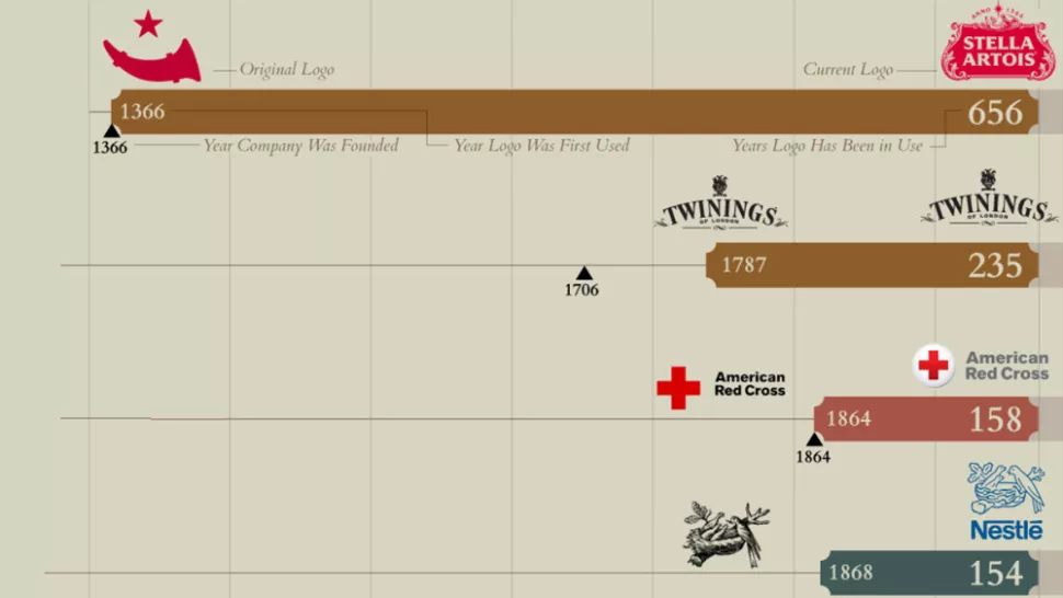
Created by the marketing delivery platform Image Relay(opens in new tab) and recently shared on Reddit by u/BoilingGiraffe(opens in new tab), the infographic compares the longevity of some of the oldest logos still in use today. I say “some” because there are plenty of brands that are missing, and the title is a little misleading since many of the logos included don’t still exist in their original form. For example, the oldest, the Stella Artois logo, has evolved significantly along with the brand – it was formerly Den Hoorn Brewery, although it still incorporates a horn in its logo.
Commentators on Reddit disagree with many of the selections, and have pointed out other candidates, noting that if Stella is included, there are plenty of other European beer brands that could feature too. It’s interesting that in its advertising, Stella Artois has often made much of its history and longevity. This shows just how long it’s been around – an incredible 656 years. As one person points out on Reddit, the original logo actually looked more modern than the current design – it’s as if it’s made itself look more old intentionally.
Second on the list is the Twinings brand of tea, which is a contender for having the oldest logo that remains unchanged – it’s had the same design for 235 years, since 1787. Meanwhile, the Red Cross logo is so simple and clearly related to its name and purpose that it’s lasted since the organisations foundation in 1864.
Other old logos that have changed very little over the years include the Nestlé logo, which today is a simplified flat version of its logo from 1868, Boots, Johnson & Johnson and of course the Coca-Cola logo. All three of them have refined their script logos over the years but kept the overall style for its heritage feel.
It’s interesting to see how heavily beer features in the list. Alongside Stella Artois, Amstel and Bass have barely changed their logos over more than a century of use, showing that perhaps beer rarely needs a makeover. Meanwhile, many of the old logos on the infographic have evolved into simplified, more streamlined designs more appropriate for digital use. That’s the case of Union Pacific, Shell and Del Monte.
The one logo that I still can’t believe hasn’t changed is the Sherwin-Williams logo. While I get the original idea, I can’t believe the brand still things an image of the planet being drowned in blood-red paint works today. It looks like a design for an activist campaign warning about an environmental calamity – “has always reminded me of old Axis of Evil propaganda,” one person on Reddit commented.
User immersion will become key to web experiences in 2023, […]


